So far, we have seen how to create Buttons and violaters using Gimp. Now let us see how to create Logos using the reflection trick. Reflections or wet surfaces have been used in many 'Web 2.0' Logos. I used this technique to create my OpenJS.com logo. This is very easy to do - once you get the idea.
Create a image with height 100px and Width 200px with white background.
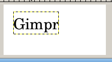
Using the Text tool, write the text of the logo with a reasonably big font size(we are web 2.0, aren't we?). Now you should have this...
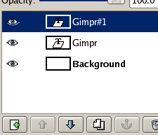
Go to the layers panel(Ctrl+L) and duplicate the layer( ) with the text of our logo...
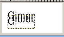
Using the flip tool( ) vertically flip the new layer and position it under the old layer using the Move tool. Now we should have something like...
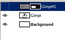
In the layers panel, right click the flipped layer and select 'Add Layer Mask' and select 'White(Full opacity)'. You should see something like this in the layers panel...
Make sure that the flipped layer's mask is selected - and choose the Gradient Tool( ). Make sure the selected colors are Black and white...

Now create a gradient like this in the flipped layer's mask...
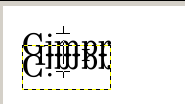
If done correctly, the layer panel will look like this...
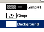
And the result will be like this...

You can tweak this image to get the perfect logo. I removed some unwanted stuff, and made the reflection layer a bit more transparent. Get the XCF File for this tutorial to see the result.


33 Comments:
You suck. This looks like shit, learn how to do something before you start teachin' it to others.
Keep it up. These are pretty good.
Thanks
Make sure that the gradient tool shape is set to Linear.
Very nice and useful page! Your tutorials are just what I was looking for! Thumbs up!
i like your tutorial too mate. dont listen to the first Anonymous, he seems a bit of a wanker.
your tutorial is simple and to the point, and provides a good base for extending this technique.
I have also done a tutoral along these lines for the GIMP:
http://ryanler.wordpress.com/2007/02/01/16/
I have also done one (sorta) for inkscape as well:
http://ryanler.wordpress.com/2007/02/06/24/
Wow. Amazingly simple tutorial, and cool end results. Thank you very much!
useful, many tks :)
I think your tutorials are great
keep it up i love it
This is exactly what I was looking for. Very simple, very easy to follow....very nice. Thanx 4 the tutorial.
This is great tutorial!
I used instruction for making an image presentig my mail adress in on my blog.
See http://returncode.wordpress.com/about/
Since there is a p in the word, the reflection should make contact with only the bottom of the p.
wow looking very nice
As I beginner, I appreciate you keeping it simple. Thanks for the help!
it's very simple and nice! but still, the P in the "Gimp" makes the reflection looks a lil bit odd!
This was just what I was looking for...I read a few other tutorials and got stuck...thanks for the step-by-step...I'm new to Gimp, so hand holding is very much needed...and the fool that left the 1st comment really needs to grow up.
Thanks !!
Please ignore the person who made the very first comment. I actually liked the straighforward approach you used in the tutorial, and I learnt from it. Yes, there are other tutorials with "more attractive" graphics (that statement in quotes is relative), but who cares. The more tutorials there are, the better for all of us. Thanks for the tutorial. It helped me. :)
Binny,
Appreciate your blog here - the time you put in to share and help the rest of us out - just what I was looking for! As others have stated - the first comment - did not even leave contact info - what a coward.
You rock!
Gregg
Exactly what I'm looking for, simple, to the point, a good starting point for anyone. Thanks.
Nice one!
@mc2w: yes. or cut the bottom (or top?) of the reflection. or keep characters like p,y,g and so on out of the text...
I love this... Thanks
Helped me outta lot
Great & Simple. Thx.
very useful... thanks :)
As others have said, don't listen to the idiot at the beginning. A very nice and simple way to create a reflection.
A++
This is great. Thanks. BTW... "Anonymous" at the beginning is just another case of low self esteem...vented through the comfortable shield of a keyboard and screen. How sad.
very good work,
Absolutely ok !I needed something similar and I found the answer here.
It works !!!
Thanks a lot !
Thanks for the lesson, I just made my first reflected logo.
This is simple yet great tutorial. Thanks!
Thanks. I was looking for a simple and easy way to use GIMP effectively and i found your blog. Created my logo. let me know if you have more tutorials.
To the dumb-ass-loser who posted this comment:
"You suck. This looks like shit, learn how to do something before you start teachin' it to others."
Where in the hell are your tutorials? I just be you're sooooo awesome at making graphics, huh? Yeah right. Shut your mouth. Why don't you grow enough balls to post your name? Or try to help someone before criticizing others? How old are you? 12 or 13 perhaps?
Grow the hell up.
To the writer of this simple to use and efficient tutorial:
I appreciate the tutorial. Thanks! Keep up the great work!
this really helped me out. I am only just beginning to use GIMP and I had problems to follow other tutorials but yours is perfect for me! just dont listen to the first comment, it did it for me! Great & please carry on...Tina
Thanks, this really helped me understand reflections! :)
after check your tutorial, its seems like not proportional on "p" letter...check on of my tutorial herecool gimp tutorial
Post a Comment